DRAFT: Your team vs kebab place. Theory of Constraints exploration for software development!
Let’s start decomposing this whole Theory of Constraints (ToC) with real life examples and have some fun!
Disclaimer
This article is IN PROGRESS - currently first installment. Consider it a draft, simple language, typos and grammar mistakes. I will be expanding this article in following weeks.
Kebab and software development?
Theory of Constraints (ToC) is associated mainly with flow optimization in manufacturing. It’s about manufacturing as much as it is about kebab restaurants and software development. Manufacturing, running kebab place and building software are all operations and Theory of Constraints is about operations. That is why I will compare operations of two kebab places I am a client of. We can then find analogies to software development and learn!
My study
Theory of Constraints is, at least currently, the biggest discovery of mine in years 2018 and 2019 combined. My recent reading is pretty straightforward:
“Beyond Phoenix” was suggesting to read “The Goal” but I was not so convinced that is why I postponed it a few months. Mistake! This summer I’ve read “The Goal” and then immediately “Beyond The Goal”.
Both titles together constitue great eye opener and Mr Eliyahu M. Goldratt was a genius.
“The meat” of kebab place operations
Brief introduction of the two companies. I don’t want to reveal the names, at least not now.
Place “K”
It’s a kebab place near my office. We go there for lunch from time to time with my colleagues. I don’t like the food there to be honest, but it’s very close to the office and it’s fast when comparing to classic restaurants. 2nd league in the world of kebabs cuisine, if not 3rd.
Place “E”
This place is different. I used to eat there a lot during my studies, but not for convenience. We were going there with friends a lot, even during winter (you cannot eat inside) as it serves super delicious kebabs. It’s the tastiest kebab I have ever experienced in Poland. Iconic place. However it turned out the taste is not the only reason that makes it awesome.
Data
I’ve recently started tracking how orders are processed in both restaurants. I do this by standing in the queue or in a nearby for a few minutes and simply voice recording or noting down everything that happens there.
Final polished notes looks like this:
0m 0s - client with red hat starts ordering
0m 20s - client with red hat finished ordering
(other entries here)
2m 15s - client with red hat gets 2x kebabs
TODO: simple chart based on the above 3x entries
I am then transforming it into more useful format in a spreadsheet and drawing charts.
WIP - Work in process
Let’s have a look at the first chart:
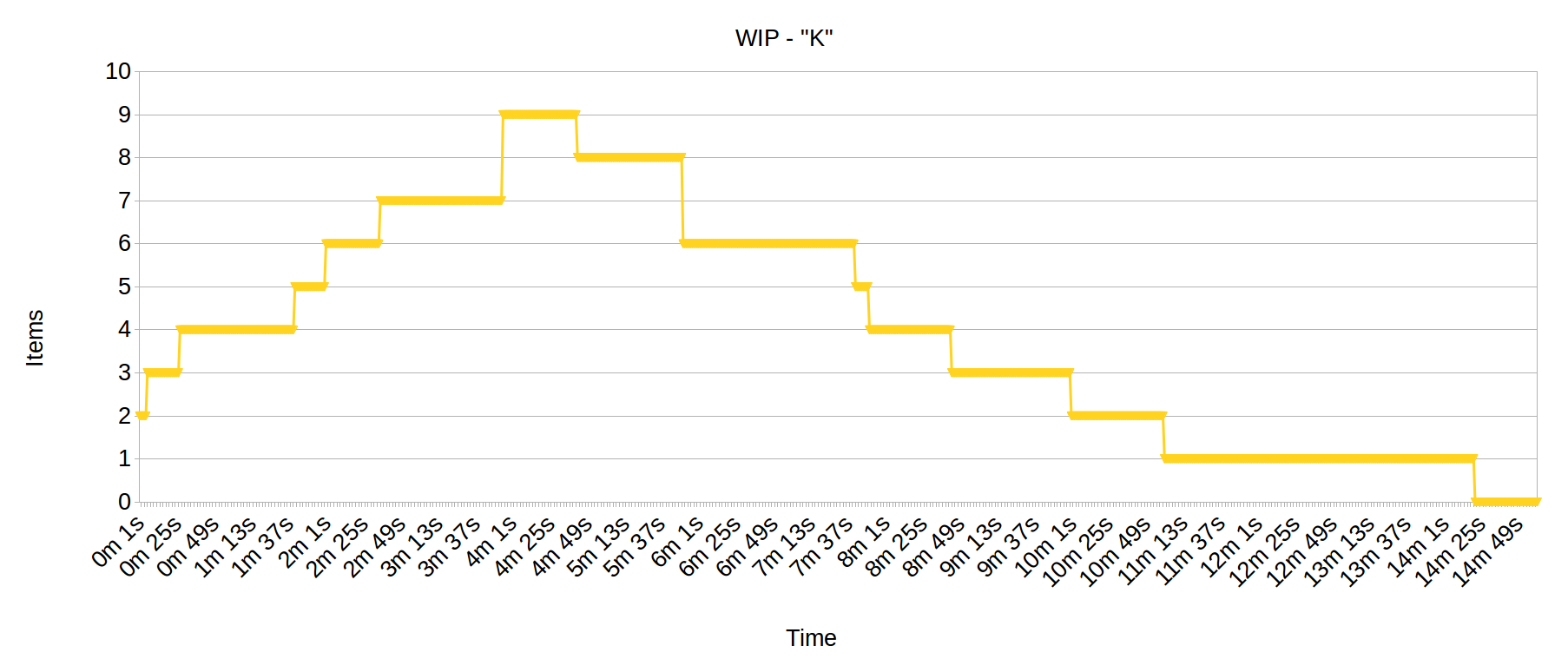
The above chart shows so called WIP (“work in process”, “work in progress”) in the place “K”.
Basics
It can be read that way:
- The timeline on the X-axis spans 15 minutes.
- The Y-axis shows the number of kebab items currently ordered but not yet delivered.
- Every time a yellow line goes straight up an order is made by a customer and when it goes straight down an order is delivered.
“K” place observations
- As you can see, at the beginning it starts with 2 items. When we approached a queue for lunch, there was a client already waiting who ordered 2 kebab pieces. Unfortunately I don’t know how long he has been there, was it 30 seconds or 5 minutes?
- On the right the yellow line reaches zero which means all kebabs are already delivered (at.
14m 30s) - nobody was in the queue, all client’s got their food and gone. - Max. WIP level was around
4m 30swhen it reached 9 items. - Last order arrived at
3m 54sand it was for 2 kebab items. This order ended a “wave” of clients who ordered 9 pieces overall. However at that time no order was delivered yet.
As mentioned, the chart above is about place “K”. Now let’s have a look at place “E”:
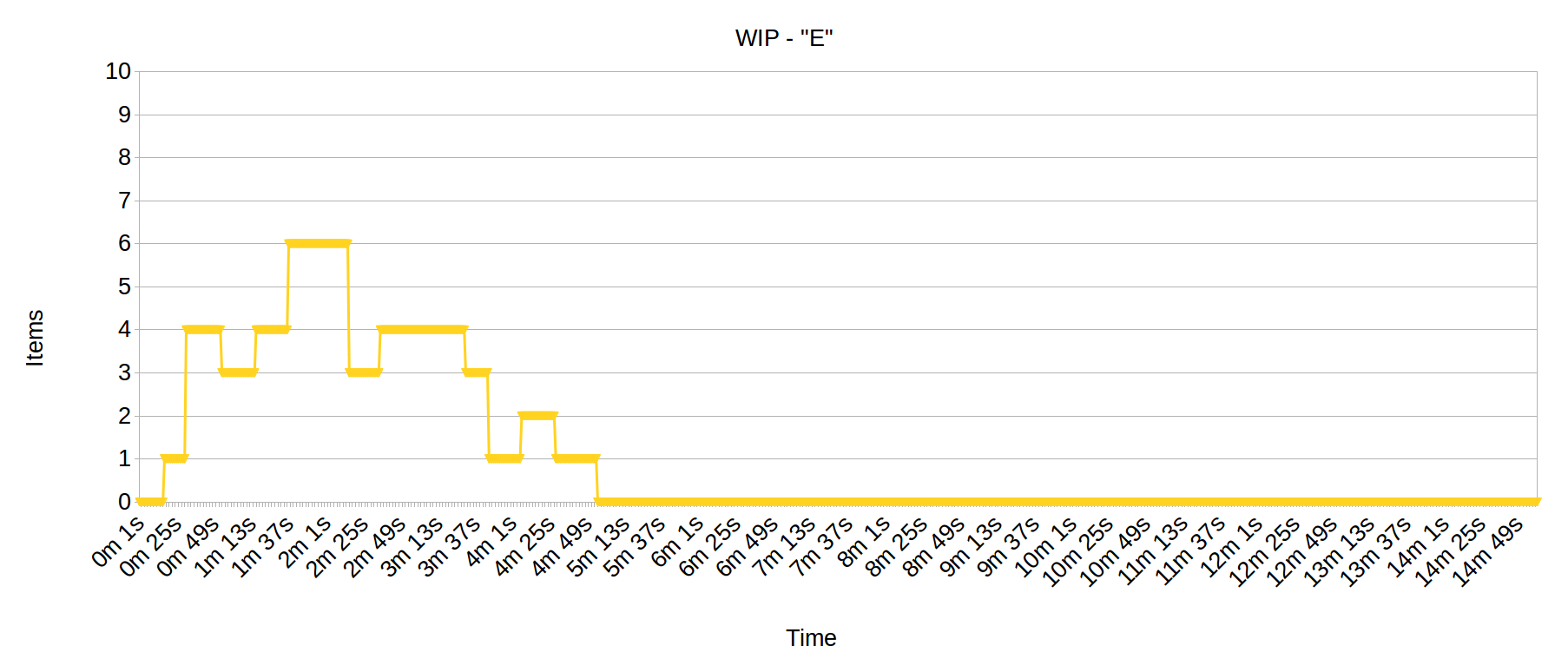
All charts have the same scales on both axes: 10 items on Y and 15 min timeline on X. This way it is very easy to compare both places.
We can observe some interesting facts from this chart!
Nobody is eating in “E”?
You may initially conclude that “E” restaurant has less number of customers and orders to prepare but it is not true! In both cases there were equal number of kebabs ordered - 9 items. You just need to count the number of times the yellow line goes straight up and how far. So in case of “E” place there were following orders: 1x piece, 3x pieces, 1x piece, 2x pieces, 1x piece, 1x piece => 9 pieces overall.
What’s more, in both restaurants last order (9th item) arrived into the system more or less at the same time. Here in “E” it was at 4m 6s, which means that the last order arrived 12s later than in “K” place (3m 54s)!
Max WIP level is at around 2m 0s - during this time it was equal to 6 so we can see that it is much lower than in “K” place where WIP reached level of 9. Overall WIP in “E” restaurant is kept on much lower level than “K”.
This also means that “E” restaurant was processing orders much faster - customers don’t have to wait long for their orders. You can see that when “E” place already delivered all orders (4m 55s) the “K” place was few seconds after delivering 1 item (it happened at 4m 42s). “K” place needed almost 10 additional minutes to deliver same amount of kebabs! You will see delivery times more clearly on the next charts.
Cumulative flow diagrams
Other interesting diagram to see is a so called cumulative flow diagram.
Let’s have a look on a flow in “K” restaurant:
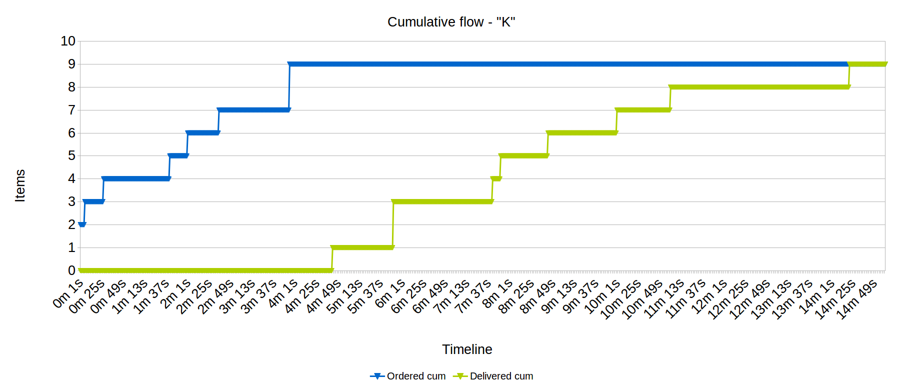
TODO: Add annotations on charts to better explain the concepts.
Again, Y and X axes have the same scale: 10 kebab items and 15 minutes timeline.
Basics
- Blue line shows a cumulative number of kebab items that were ordered at given time.
- Green line shows a number of kebabs delivered at given time.
- Both lines merge on the right at the end of the timeline (around
14m 30s) when the last order was delivered and nobody was in the queue. - What we are missing here, as mentioned above, is a time when the initial 2 items order was actually placed. Let’s assumed it was seconds before we approached the place. What is easy to see in this chart is a lead time, that is the time it takes to make kebab and deliver an order to the customer. You simply look at horizontal distances between the lines.
- Vertical distances show WIP.
On the other hand this is how cumulative flow diagram looks in “E” place:
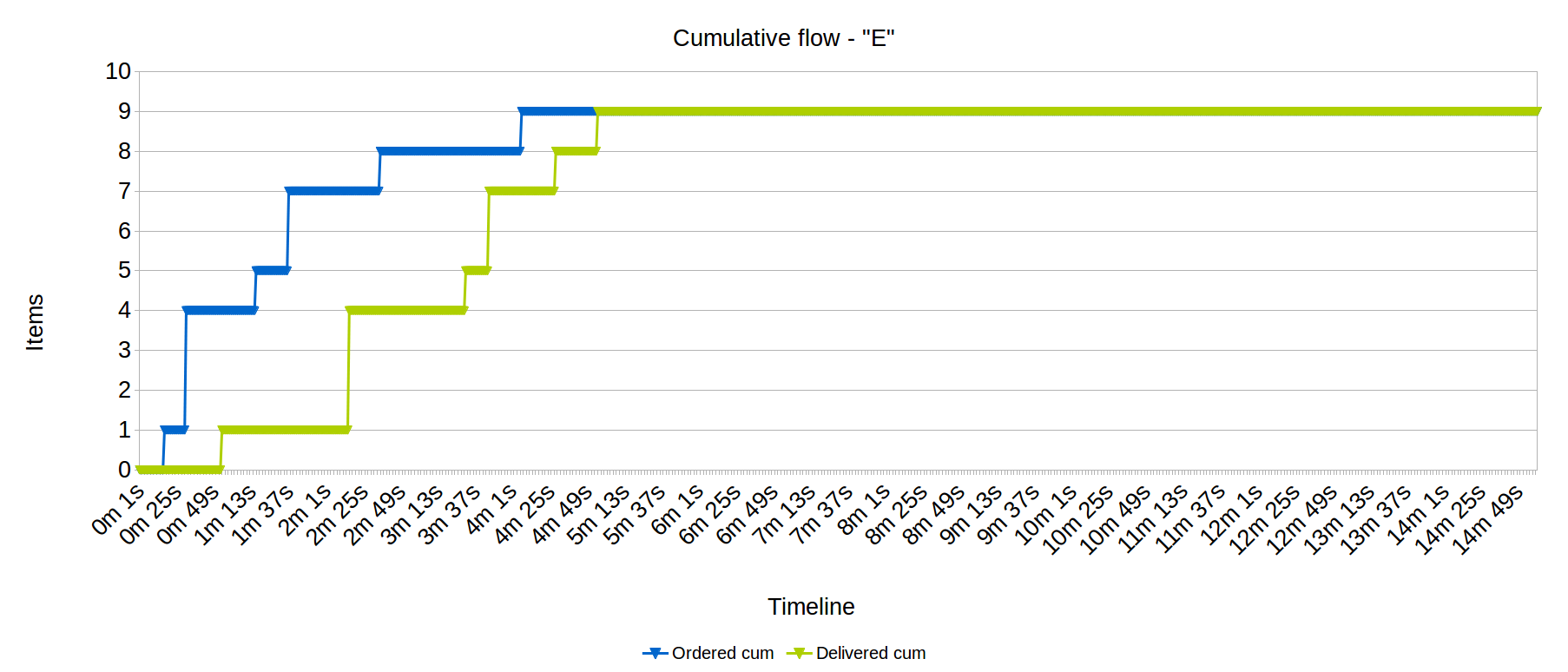
You probably see the difference. Yes, the manager of the restaurant is sharp one who read “The Goal”. I would like she builds software with me!
Pay, 10 seconds, eat!
First issue we can observe is that delivery times are very short. Orders are delivered immediately.
Look at the first order, it was delivered 37 seconds since the customer opened his mouth and started saying that he wants 1.5 portion with medium spicy sauce. It is not shown on the chart but he got his kebab exactly 10 seconds after he paid for himself. In my opinion that is what makes the “E” restaurant a great place!
Second fact worth observing is that this place follows strictly FIFO rule - first in, first out. You can see on the chart clear regularity in how far both lines go up. This regularity or rather FIFO rule is missing in “K” place. I will elaborate on this in next iterations as this has serious implications on the flow of work.
The difference - meet Herbie
Why “E” is doing better than “K”? I’ve observed a few issues but as for now I will just mention one.
The number one differentiator is how these restaurants are tackling… toasting. I mean here wrap made of bread that has to be grilled. In both places this is their Herbie (see scout hike in “The Goal” book), their bottleneck aka constraint. “E” is handling it very well, according to best practices, and completely different way than “K” restaurant. I will elaborate on it in next iterations of the article!
Installments
- 2019-09-16 - added charts from visits in two kebab restaurants, 2x WIP charts, 2x cumulative flow diagrams
Top priority TODOs:
- Basic WIP chart based on notes example.
- Add annotations on charts (comments, pointers) to better explain and comment what is there
- Add all raw data from my notes
Subscribe to my RSS feed, follow me on Twitter or LinkedIn so that you will be notified about next iterations of the article!
Feedback
Any form of feedback is highly welcomed! I want to expand this article into a longer one or a series of articles and then transform it into a conference speech.